From previous post () the minimum working example will be used.
import
numpy as np
import
matplotlib.pyplot as plt
x=np.arange(0,20.01,
0.01)
y
= np.sin(x)
plt.figure()
plt.plot(x,y)
plt.show()
The command for creating the labels (names) of x and y
axis is to write following commands.
plt.xlabel()
plt.ylabel()
By writing this two commands in the python script the
python would return TypeError: xlabel() missing 1 required positional argument:
'xlabel' during execution since the label name is missing inside the xlabel
brackets.
To give x and y axis label names write the following
commands just before the plt.show().
plt.xlabel(‘x’)
plt.ylabel(‘y’)
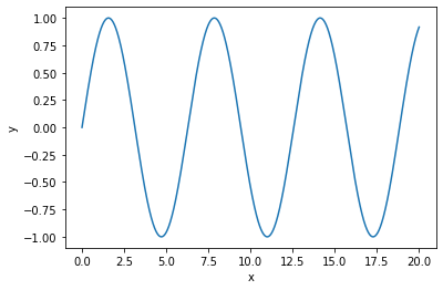
After the python script exection you should see the
label names of x and y axis as shown in the following figure.
Figure 1 – The
result of minimum working example with x and y labels
Matplotlib
also has the ability to create label names as mathematical expression. This is
done by putting the dollar sings before and after the mathematical expression (‘$...$’).
For example let’s create x and y labels as mathematical expressions where y
will be written as ‘$sin(x)$’
plt.xlabel(‘$x$’)
plt.ylabel(‘$sin(x)$’)
The
previous two lines are placed just before plt.show(). The result is shown in
the following figure.
Figure 2 –
The result of minimum working example with x and y labels written in the form
of mathematical expression.
At
the end the python code of minimum working example used in this tutorial.
import
matplotlib.pyplot as plt
import
numpy as np
x
= np.arange(0,20.01,0.01)
y
= np.sin(x)
plt.figure()
plt.plot(x,y)
plt.xlabel("$x$")
plt.ylabel("$sin(x)$")
plt.show()


Nema komentara:
Objavi komentar